
Article 1: The Visual-Action Gap — Why Passive Reading Fails Lifestyle Audiences
Lifestyle readers rarely seek pure theory. When someone reads an article on morning routines, decluttering, or meal planning, their core desire is behavioral change. However, long blocks of unbroken text place a heavy cognitive load on the reader. The brain must read, interpret, extract relevant steps, and then self-structure a process before taking action.
Bridging this gap requires visual utility: pairing descriptive writing with structured, scannable elements. Integrating visual tools directly into the reading flow—such as micro-checklists, visual progress bars, and prompt cards—transforms passive consumption into practical engagement. Readers do not just read about an organized lifestyle; they immediately visualize their path to achieving it.
- Cognitive Load Reduction: Break multi-step concepts into visual cards to reduce mental processing friction.
- Active vs. Passive Engagement: Readers who interact with an embedded checklist or template show significantly higher dwell times and lower bounce rates.
- The Completion Bias: Providing a clear, low-barrier first task triggers the brain’s natural inclination to finish an started sequence.
Article 2: The Anatomy of a High-Converting Lifestyle Checklist
A successful lifestyle checklist is not merely an unorganized list of bullet points with empty square boxes. Poorly designed checklists create decision paralysis by presenting too many tasks without a hierarchy. High-converting checklists apply structural principles that make execution feel frictionless and rewarding.
First, categorize tasks into distinct phases (e.g., “Night Before,” “Morning Launch,” “Midday Reset”) rather than a single monolithic list of ten items. Second, limit each section to 3–5 items; working memory fatigues quickly. Finally, use clear action-first verbs (e.g., “Pack gym bag” instead of “Gym items”).
- Hierarchical Grouping: Cluster related items under visual sub-headers to make scanning intuitive.
- Micro-Wins at the Top: Place the quickest, easiest action first to generate early momentum.
- Sensory Cues: Use subtle visual cues like contrasting check-marks, distinct border radius treatments, and balanced negative space to keep the layout calm.
Article 3: Modular Templates — Providing the Architecture for Complex Habits
While a checklist verifies completion, a template provides the underlying structure for how to complete an activity. When lifestyle readers attempt to implement complicated routines—such as weekly batch cooking, home budget audits, or capsule wardrobe planning—they often abandon the process because the blank page is intimidating.
Modular templates remove that initial friction by establishing pre-built containers. A weekly meal prep template with defined fields for proteins, complex carbs, vegetables, and prep time turns an open-ended question (“What should I eat this week?”) into a simple fill-in-the-blank exercise. Providing templates in both digital formats (Notion, Google Sheets) and printable PDFs caters to diverse lifestyle workflows.
- Scaffolding Over Rigidity: Offer flexible boxes and prompt hints rather than rigid rules, letting readers tailor the system to their households.
- Dual-Format Delivery: Provide an interactive digital view for desktop/mobile users alongside a printer-friendly version with minimal ink coverage.
- Visual Guardrails: Use muted borders and alternating row shading to prevent optical fatigue during data entry.
Article 4: The Strategic Architecture of Lifestyle Planners
Planners operate on a broader time horizon than single-use checklists. They connect short-term daily actions to medium-term weekly reflections and long-term quarterly milestones. For lifestyle publications, offering structured planners elevates your brand from an informational source to an everyday productivity partner.
A well-crafted lifestyle planner balances structure with reflection. It provides defined schedules without feeling overly corporate, incorporating dedicated spaces for habit tracking, mental wellness check-ins, water intake, and evening gratitude. The goal is to design an intentional tool that fosters mindful living rather than frantic task-checking.
- The Rule of Three: Structure daily pages around three non-negotiable core priorities to protect focus.
- Weekly Retrospective Spreads: Incorporate end-of-week reflection prompts (e.g., “What energized me? What drained me?”) to reinforce mindful habit adjustment.
- Balanced Density: Avoid crowding the page; open margins and clean lines make using the planner a calming ritual rather than a chore.
Article 5: Typography, Color Theory, and Negative Space in Asset Design
The visual styling of your printables and digital assets dictates how readers feel while using them. Aggressive, hyper-saturated colors and cramped fonts induce stress, directly countering the wellness and balance your content promotes. High-engagement lifestyle resources rely on calm, editorial design principles.
Adopt a muted, nature-inspired palette—such as warm taupes, sage greens, slate greys, and terracotta accents. Use clean typography hierarchies: an elegant serif or refined modern display font for titles, paired with a legible, neutral sans-serif for functional prompts and input lines. Generous whitespace around input boxes ensures the design remains readable and uncluttered once written in.
- The 60-30-10 Color Rule: Use 60% neutral background space, 30% structural lines/typography, and 10% accent color for interactive checkboxes and highlights.
- Print-Friendly Standards: Ensure designs print crisply in black-and-white without losing legibility or creating dark, muddy blocks of ink.
- Font Pairing Balance: Pair a high-character header font with a clean body font at minimum 10pt size to ensure comfortable reading.
Article 6: Lead Magnets and Audience Growth — Turning Free Assets into Subscribers
Checklists, templates, and planners are among the highest-converting lead magnets across lifestyle, wellness, and personal development niches. While generic “Subscribe to our newsletter” calls-to-action often convert at under 2%, targeted content upgrades featuring relevant printables routinely achieve double-digit opt-in rates.
The key to high conversion is hyper-specificity. Rather than offering a generic “Wellness Planner” site-wide, pair a specific “7-Day Low-Inflammation Meal Prep Guide & Grocery Template” directly inside a blog post about gut health and clean eating. When the free tool serves as the logical next step to the article, readers gladly trade their email address for instant access.
- Contextual Content Upgrades: Embed visual download banners halfway through and at the conclusion of targeted articles.
- Instant Automated Delivery: Deliver the digital asset via a clean welcome email within 60 seconds of sign-up to build immediate credibility.
- Onboarding Nurture Sequences: Follow up the asset delivery with a 3-part email series showing the reader how to get the most out of the template.
Article 7: Interactive Digital Assets — Notion, Canva, and Fillable PDFs
Modern lifestyle readers split their routines between analog pen-and-paper and digital workspaces. Limiting your resources to static images or non-editable documents ignores readers who manage their lives on smartphones, tablets, and laptops. Providing interactive formats expands the utility of your content.
Fillable PDFs with editable form fields and auto-calculating totals allow users to keep digital records without specialized software. Concurrently, sharing customizable Canva template links lets readers personalize colors and fonts to their tastes, while structured Notion dashboards offer dynamic databases for tracking habits, wardrobe inventories, and reading lists.
- Fillable PDF Forms: Ensure tab-indexing is properly ordered so users can seamlessly jump through input fields using their keyboard.
- Notion Hubs: Design linked databases that automatically roll up daily habit checks into weekly visual progress summaries.
- Device Responsiveness: Test digital templates on both mobile screens and desktop monitors to ensure text boxes remain comfortably editable.
Article 8: Visual Storytelling Across Pinterest, Instagram, and TikTok
Actionable assets are inherently shareable because they convey value in a single glance. Platforms like Pinterest, Instagram, and TikTok thrive on clear visual organization, making styled lifestyle templates and planners primary drivers of organic social traffic.
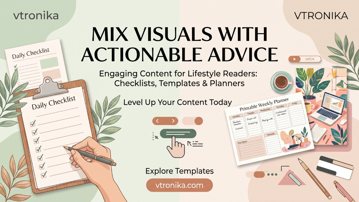
To maximize reach, showcase your assets in real-world contexts. Instead of publishing flat digital mockups, photograph printed planners on clean linen desks with a warm beverage, or create short-form video clips demonstrating the tactile process of filling out a morning routine checklist. Showing the physical ritual behind the tool makes it desirable and relatable.
- The “Fill-It-In” Hook: Short-form videos of someone physically ticking a box or writing on a planner generate high completion rates on TikTok and Reels.
- Pinterest Pin Architecture: Design vertical 2:3 ratio pins highlighting the finished, filled-out template with bold, benefit-driven headlines.
- Micro-Previews on Carousel Slides: Use swipeable Instagram carousels to showcase individual sections of a planner before presenting the download link.
Article 9: Community-Driven Iteration — Designing What Your Readers Actually Need
The most effective templates and planners are not developed in isolation; they evolve through continuous reader feedback. Launching an asset should be viewed as the start of an ongoing conversation. Observing where readers drop off, what fields they leave blank, or what additional columns they request provides direct insight for future iterations.
Encourage readers to share photos of their completed planners on social media using a dedicated hashtag or within a private community group. Reviewing these shared pages reveals which sections deliver genuine utility and which ones cause confusion, providing clear guidance for your next product cycle.
- Feedback Loops: Include a short feedback prompt on the final page of digital workbooks asking what features or layouts were most useful.
- User-Generated Content Campaigns: Feature reader-submitted planner layouts in your weekly newsletter to build community and show real-life use cases.
- Data-Informed Redesigns: If analytics show low re-download rates on a template, simplify the layout by eliminating secondary input fields.
Article 10: Monetization Pathways — From Free Printables to Premium Product Suites
Offering free checklists and planners is a proven strategy for building authority and email lists, but it also creates a clear path to direct monetization. Once your audience trusts your design aesthetic and organizational frameworks, you can expand free resources into premium, revenue-generating products.
Monetization can take several forms: packaging comprehensive digital workbooks into paid bundles, launching quarterly subscription-based planning portals, or partnering with on-demand printers to produce premium physical stationery, journals, and linen-bound planners. Because your free assets have already proven their value, your audience will willingly invest in your complete lifestyle suites.
- Digital Bundles: Combine multiple complementary templates (e.g., Budget Tracker + Meal Planner + Habit Ledger) into a discounted “Master Life Toolkit.”
- Physical Print-on-Demand: Test demand for physical bound planners using small batch print runs or on-demand manufacturing partners to eliminate inventory risk.
- Subscription Workbooks: Offer seasonal or monthly planning drops inside a paid membership community for dedicated lifestyle enthusiasts.