
1. The 5% Fallacy: The Logo as an Identifier, Not the Identity
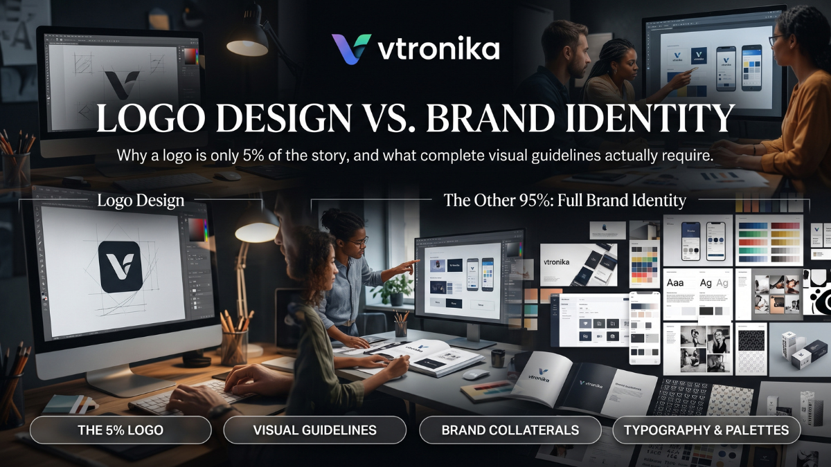
Mistaking a logo for an entire brand is one of the most common strategic errors in business. In functional terms, a logo represents approximately 5% of a brand’s narrative. Its primary purpose is not to communicate every corporate mission, product feature, or cultural value; its true function is identification, not communication.
A logo acts as a visual signature—a shorthand mental anchor that allows consumers to distinguish one entity from another in a crowded marketplace. It does not generate emotional loyalty on its own. Rather, a logo is an empty vessel that absorbs meaning, credibility, and sentiment over time based on the quality of a company’s products, customer service, and market presence. Just as an individual’s signature or passport photo does not convey their personality, integrity, or intelligence, a graphic mark cannot carry the strategic weight of an enterprise without a broader ecosystem behind it.
2. Defining Brand Identity: The Remaining 95% Ecosystem
If the logo is merely the tip of the iceberg, Brand Identity constitutes the 95% submerged beneath the surface. Brand identity is the deliberate sensory and visual system through which an organization projects its values, personality, and positioning to the world.
This broader ecosystem encompasses every touchpoint where a customer interacts with the business:
- Visual Atmosphere: The layout structure of websites, the art direction of photography, packaging textures, and motion graphics.
- Verbal Tone: The cadence, vocabulary, and personality of copywriting across marketing campaigns, customer support tickets, and legal terms.
- Sensory Cohesion: The physical feel of unboxing materials, retail architecture, UI interactions, and even sonic branding.
When these elements operate under a cohesive visual and strategic logic, the brand remains instantly recognizable even if the logo is completely covered or removed.
3. Logo Anatomy and System Architecture: Beyond the Primary Mark
A static, single-file logo cannot survive modern responsive environments. A complete visual system requires a versatile family of marks adapted for disparate aspect ratios, physical scales, and digital contexts:
[ Primary Master Logo ]
  (Full lockup: Logomark + Wordmark + Optional Tagline)
         │
         ├──► [ Secondary / Horizontal Lockup ] (Navbars, header strips, letterheads)
         │
         ├──► [ Sub-mark / Brandmark ] (Social avatars, app icons, favicons, embroidery)
         │
         └──► [ Monogram / Lettermark ] (Watermarks, packaging seals, micro-touchpoints)
In addition to lockup variations, brand guidelines must define technical deployment rules:
- Exclusion Zones: Clear mathematical buffers (often derived from a letter height within the logo, such as an “X” height) where no typography or graphic elements may intrude.
- Minimum Reproduction Sizes: Strict minimum limits defined in pixels (
px) for digital screens and millimeters (mm) for offset print to prevent illegibility. - Strict Don’ts: Explicit visual warnings against stretching, rotating, adding arbitrary drop shadows, altering letter spacing, or applying unapproved color combinations.
4. Chromatic Architecture: Defining Precision Color Systems
Color is the most emotionally immediate element of visual perception. A professional brand identity system moves far beyond selecting a pleasing hue; it builds a mathematically balanced palette calibrated across diverse reproduction technologies.
| Palette Tier | Composition | Functional Role |
| Primary Palette | 1–2 Dominant Brand Hues | Drives immediate market recognition and brand association. |
| Secondary Palette | 2–4 Complementary Hues | Provides visual contrast, accents, call-to-action buttons, and badges. |
| Neutral Palette | 3–5 Grays, Creams, or Off-Blacks | Forms the structural foundation for UI backgrounds, body typography, and borders. |
| Semantic Palette | Success (Green), Warning (Amber), Error (Red) | Powers functional digital interfaces without clashing with primary brand colors. |
To ensure identical appearance across all mediums, guidelines must supply explicit conversions: HEX and sRGB for screens, CMYK for commercial four-color process printing, and Pantone (PMS) spot colors for accurate physical packaging, textiles, and merchandise.
5. Typographic Systems: Hierarchy, Contrast, and Accessibility
Typography gives a brand its physical voice in written communication. A haphazard selection of fonts dilutes brand authority, while a disciplined typographic scale creates order and enhances readability.
A complete visual system establishes:
- Primary Typeface (Display / Headings): Chosen for personality, character, and visual distinctiveness on hero sections, billboards, and marketing covers.
- Secondary Typeface (Body / Functional): Optimized for long-form legibility, structural clarity, and multi-screen readability at micro sizes.
- System / Fallback Typefaces: Standard, universal fonts (such as Arial, Helvetica, or system sans-serif) to ensure clean rendering when custom web fonts fail to load or within plain-text email environments.
- The Modular Type Scale: A strict mathematical hierarchy detailing font size, line-height (leading), letter-spacing (tracking), and paragraph spacing across mobile and desktop breakpoints.
- Accessibility Standards: Explicit contrast ratios adhering to WCAG 2.1 AA/AAA compliance, ensuring text remains readable for visually impaired audiences.
6. Art Direction and Photography Style: Building Proprietary Imagery
Stock photography is where brand identities often fall apart. Without clear art direction, teams fall back on generic stock imagery that contradicts the brand’s intended positioning. A robust guidelines manual outlines an exact photography ethos:
- Lighting and Temperature: Specifies whether imagery should rely on warm natural sunlight, high-contrast studio strobes, moody chiaroscuro, or clinical, hyper-clean commercial illumination.
- Subject Composition and Framing: Establishes guidelines for candid documentary-style framing versus staged geometric portraits, depth-of-field expectations, and negative space allocation for overlay text.
- Color Grading and Post-Processing: Provides LUT (Look-Up Table) profiles, saturation ceilings, and contrast curves to ensure photos sourced from different photographers match when viewed together.
- Casting and Authenticity: Defines human representations, wardrobe aesthetics, emotional expressions, and realistic environments that mirror the target demographic.
7. Supporting Visual Elements: Patterns, Textures, and Iconography
While typography and color set the tone, supporting graphic devices tie complex layouts together. These elements create proprietary visual shorthand:
- Iconography Language: Custom icon sets designed with uniform corner radiuses, consistent stroke weights (e.g., 1.5px outline vs. solid glyphs), matching terminal styles, and set bounding boxes (e.g., 24×24px grid).
- Abstract Textures and 3D Assets: Custom vector patterns derived from fragments of the logo mark, topographic contours, mathematical grids, or textured renders that serve as textural backgrounds.
- Data Visualization Rules: Systematic guidelines for charting and graphing, ensuring bar charts, scatter plots, and network diagrams utilize approved brand palettes and typographic labels rather than default spreadsheet styling.
8. Layout Grids, Spatial Systems, and Responsive Adaptation
A brand identity must translate cleanly across a variety of screen sizes and physical formats—from a 16×16 pixel browser favicon to an 80-foot highway billboard. This requires a predictable spatial framework.
[ Print & Editorial ]                [ Digital & UI/UX ]
- Golden Ratio / Modular Grid        - 8pt / 4pt Spatial System
- Column Grids (6, 12, or 16 col)    - Fluid Breakpoints (Mobile, Tablet, Desktop)
- Standard Print Margins & Bleeds    - Dynamic Padding & Auto-Layout Tokens
Guidelines codify spatial behavior using proportional spacing increments (e.g., 4px, 8px, 16px, 24px, 32px, 64px). This eliminates guesswork for software engineers, packaging fabricators, and editorial designers, ensuring that every interface or print piece retains identical spatial breathing room and balanced proportions.
9. Verbal Identity and Tone of Voice: Aligning Visuals with Language
Visual design cannot succeed in a vacuum; it must align with how the brand speaks. A visual identity manual that ignores language leads to a disconnect between how a brand looks and how it sounds.
A complete identity manual defines the brand’s verbal guidelines:
- Brand Personality Attributes: 3 to 4 defining personality traits (e.g., “Authoritative but never arrogant,” “Inquisitive, sharp, and concise”).
- Copywriting Dos and Don’ts: Side-by-side examples demonstrating how to rewrite generic corporate jargon into the brand’s authentic voice across marketing headlines, error states, and release notes.
- Grammar and Mechanics: Guidelines on punctuation usage, capitalization rules for headings, Oxford comma usage, and standard terminology definitions.
10. Governance, Implementation, and Asset Delivery
The most thoughtfully designed visual identity system will deteriorate without proper governance and clear implementation pathways. Brand guidelines must act as a functional, living manual rather than a static presentation deck.
Modern brand management achieves this through:
- Design Token Integration: Exporting color hex codes, font families, and spatial variables directly as JSON/CSS design tokens, bridging the gap between Figma design systems and production codebases.
- Centralized Digital Asset Management (DAM): Providing cloud-hosted vector formats (SVG, EPS), high-resolution raster files (PNG, WebP), and print-ready PDFs organized logically by lockup and color mode.
- Review Workflows and Brand Custodians: Establishing clear internal approval processes for external vendor collateral, retail franchise designs, and co-branded enterprise partnerships.